Thread
Marketplaces are advertising themselves as launchpads and the place to be for games.
But they do a bad job at presenting games and converting players.
A thread on the current pain points of web3 gaming and how we can solve them: 👾🧵
But they do a bad job at presenting games and converting players.
A thread on the current pain points of web3 gaming and how we can solve them: 👾🧵
Some hard truths about web3 gaming right now:
• No great game platform available yet
• Mints are underpeforming
• Projects are relying on launchpads
• Few and small creators
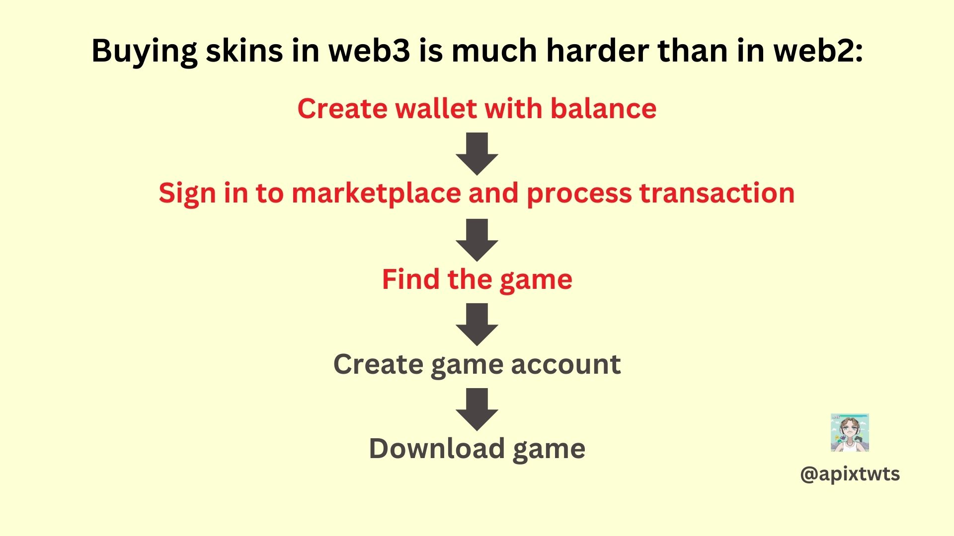
• More layers to buy an item in web3 than web2
• No great game platform available yet
• Mints are underpeforming
• Projects are relying on launchpads
• Few and small creators
• More layers to buy an item in web3 than web2
Right now, we don't have gaming platforms like Steam, Epic or the App store to discover web3 games.
Hence many possible players will come across your game on marketplaces for the first time.
Marketplaces are a place for discovery in web3!
Hence many possible players will come across your game on marketplaces for the first time.
Marketplaces are a place for discovery in web3!
But marketplaces don't do a great job at converting players to your game, this is also affected by additional layers until you get to play a game.
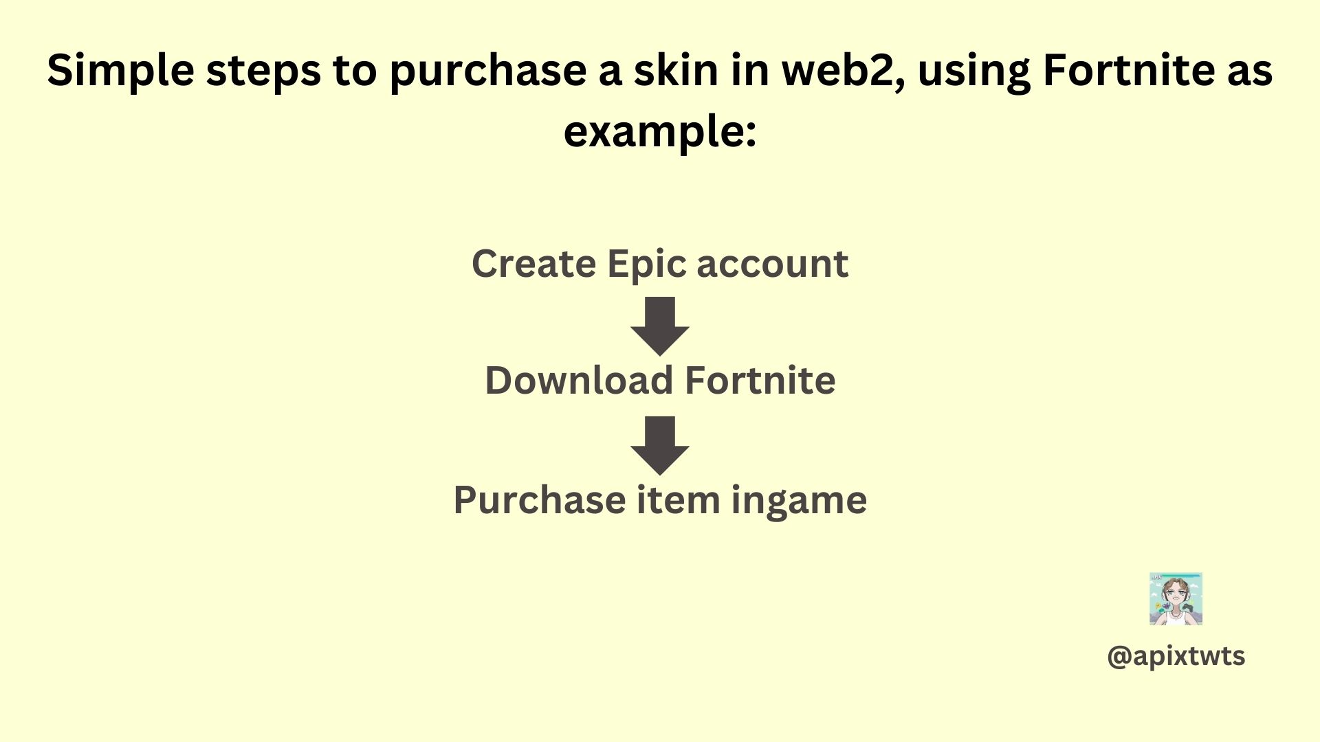
Let's try to buy a skin in Fortnite.
You create an Epic account, download Fortnite, purchase the item ingame and you're done.
Let's try to buy a skin in Fortnite.
You create an Epic account, download Fortnite, purchase the item ingame and you're done.
Let's try to buy a skin for a web3 game.
We need a wallet with balance, and we need to sign in to the marketplace and process the transaction.
Then we need to find the game (likely on a platform), create an account, connect our wallet and finally we can enjoy our skin ingame.
We need a wallet with balance, and we need to sign in to the marketplace and process the transaction.
Then we need to find the game (likely on a platform), create an account, connect our wallet and finally we can enjoy our skin ingame.
Marketplaces have the chance to lead players to the games, and even act as a platform themselves.
This way they're able to reduce friction and steps for a cleaner user experience.
But the current marketleaders don't do a great job yet, let's look at some examples:
This way they're able to reduce friction and steps for a cleaner user experience.
But the current marketleaders don't do a great job yet, let's look at some examples:
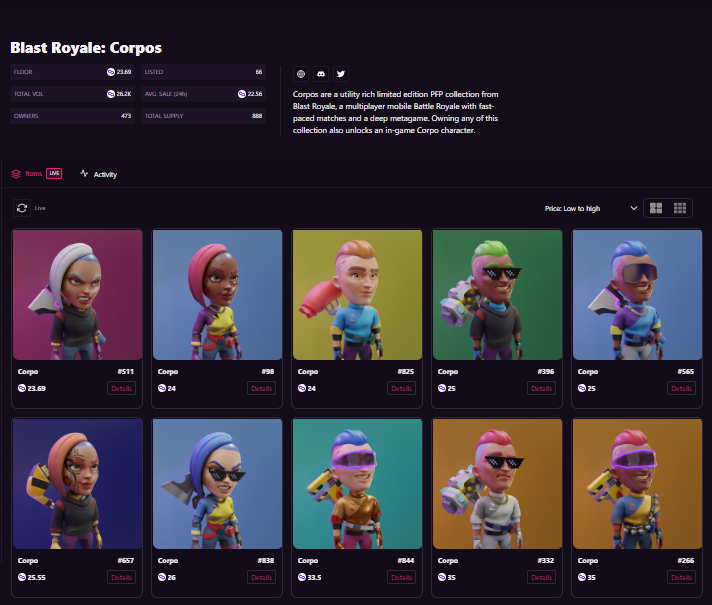
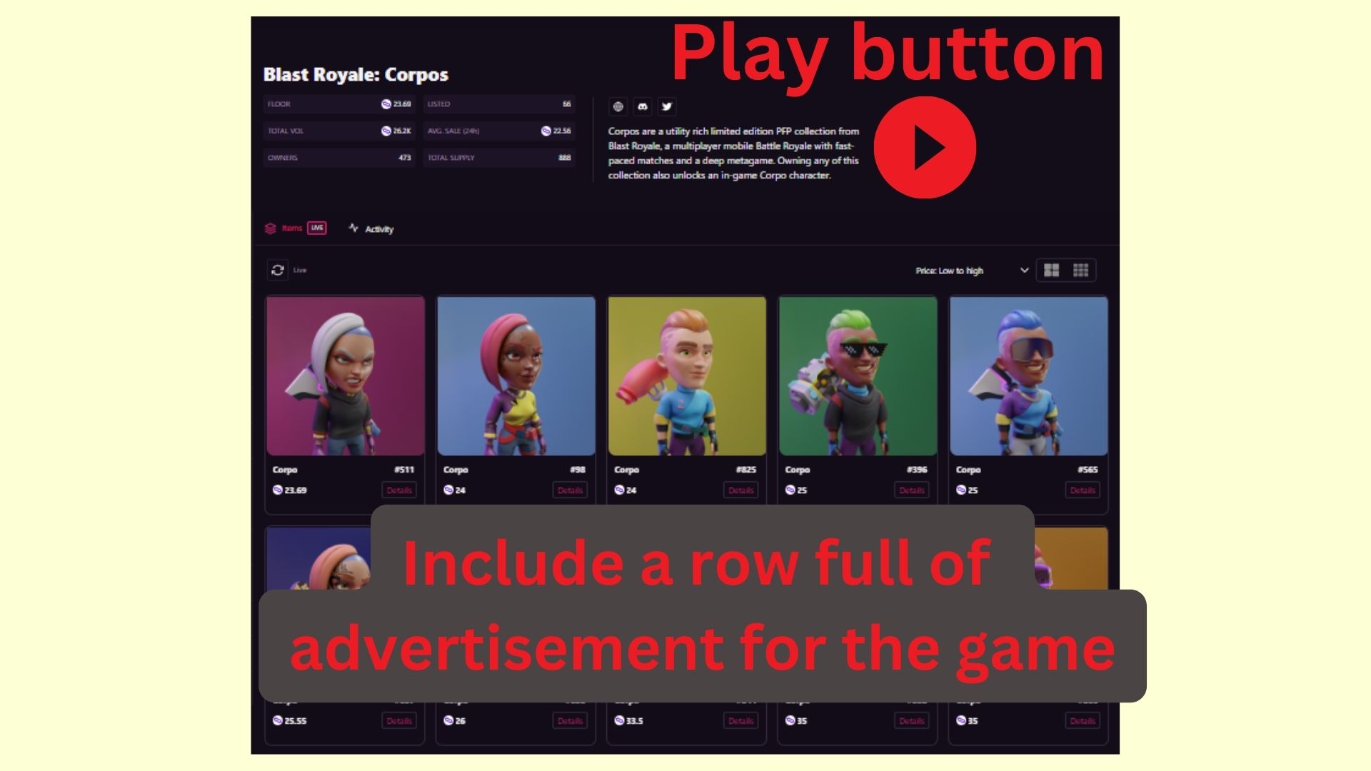
1. @MagicEden
→ Typical marketplace UI
→ No game footage to watch
→ Tiny buttons which lead to socials of the game but not the game itself
→ No information how you get to the game
Blast Royale is already in the appstore, but on ME it looks like "just another NFT collection"
→ Typical marketplace UI
→ No game footage to watch
→ Tiny buttons which lead to socials of the game but not the game itself
→ No information how you get to the game
Blast Royale is already in the appstore, but on ME it looks like "just another NFT collection"
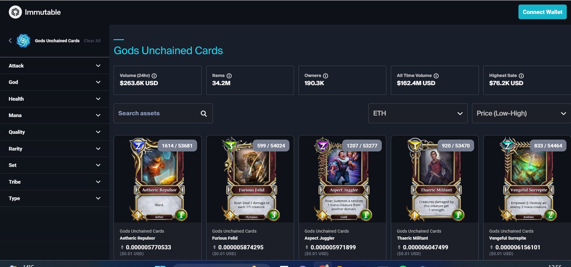
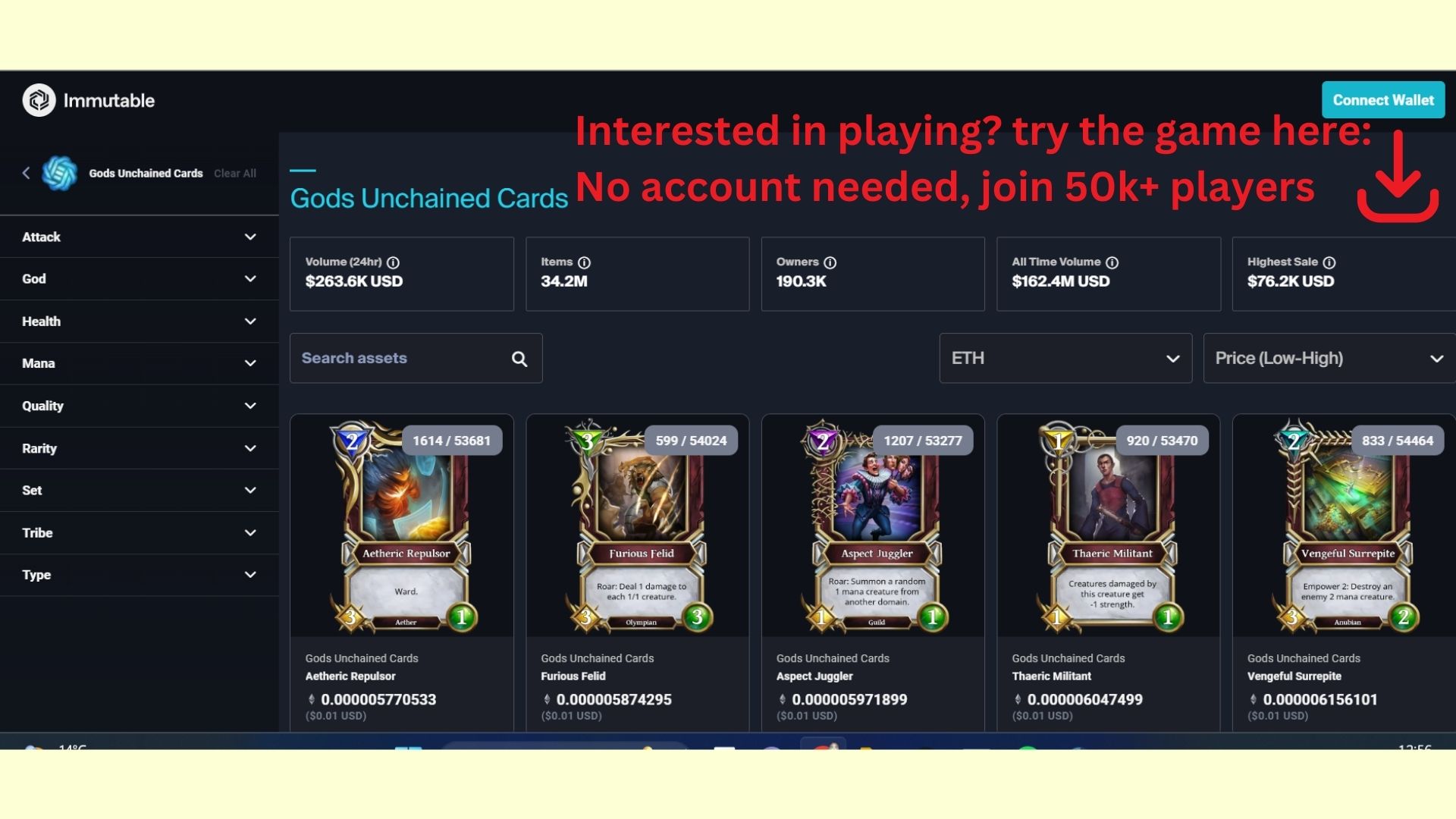
2. @Immutable Marketplace
The same pain points as Magic Eden.
Because Immutable is gaming focused, it introduces each collection as a gaming collection, but there are also no leads to the game or game footage.
The same pain points as Magic Eden.
Because Immutable is gaming focused, it introduces each collection as a gaming collection, but there are also no leads to the game or game footage.
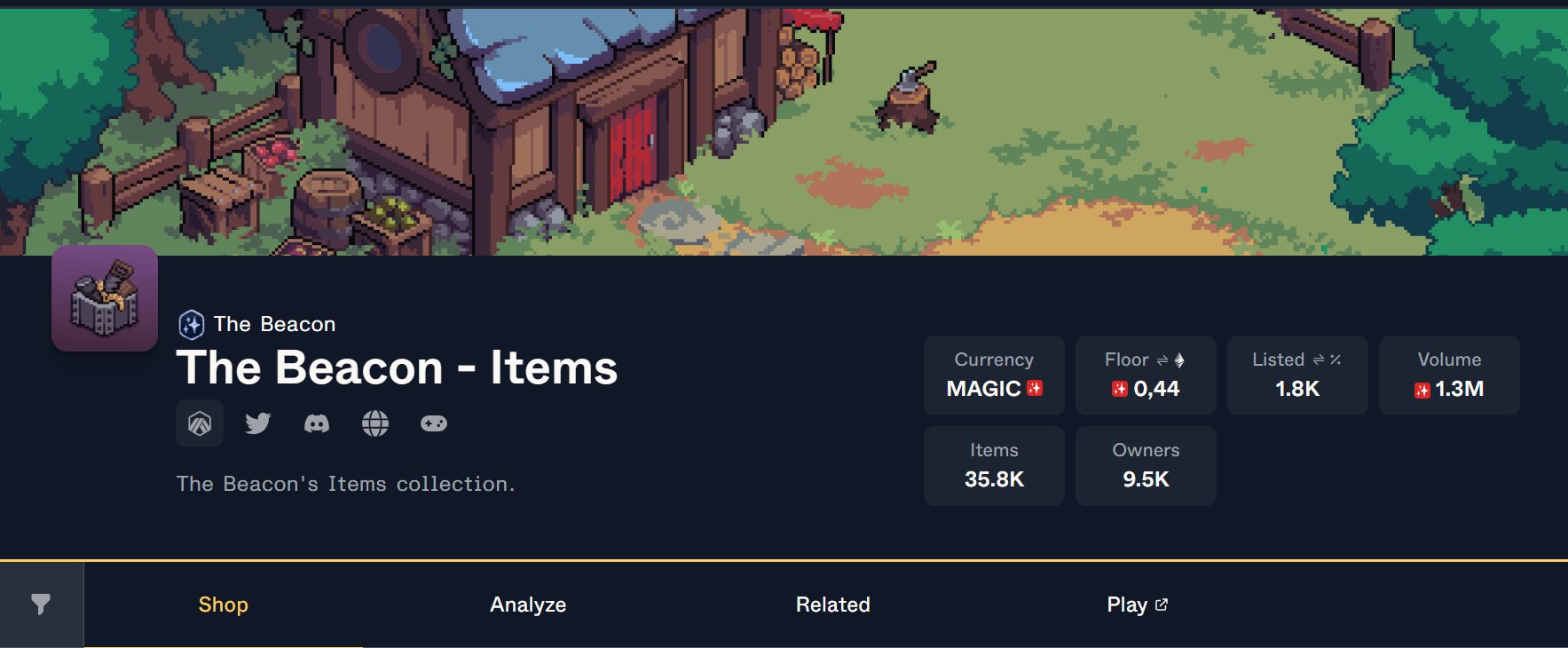
3. @TroveByTreasure
Trove does a slightly better job.
It has an extra button which leads to the game and a section "Play" which leads you to the game, too.
But also no gameplay, and newbies have no clue what Beacon is and what the items are for, there is no description.
Trove does a slightly better job.
It has an extra button which leads to the game and a section "Play" which leads you to the game, too.
But also no gameplay, and newbies have no clue what Beacon is and what the items are for, there is no description.
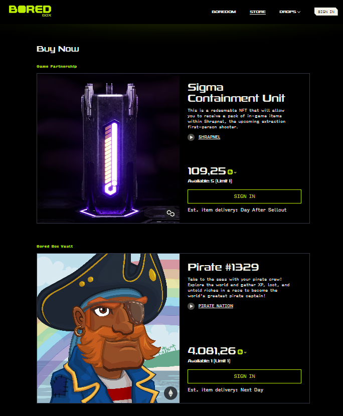
4. @boredbox by @BoredElonMusk
Boredbox is an alternative to Marketplaces. It's not focused on the trading aspect, but on buying.
The presentation arouses more interest in the item/game than normal marketplaces, but it's not a complete solution.
Boredbox is an alternative to Marketplaces. It's not focused on the trading aspect, but on buying.
The presentation arouses more interest in the item/game than normal marketplaces, but it's not a complete solution.
So how can we improve the UI/UX to increase game discovery and player conversion?
Here are some simple ideas:
(these ideas took 5 minutes, but improve the UX a lot already)
Here are some simple ideas:
(these ideas took 5 minutes, but improve the UX a lot already)
A lot of the current interfaces are counterintuitive and are not helping the games to raise awareness.
Think of web2 ads, they ALWAYS want you to click somewhere to get to a game.
In Steam and Epic you can download games right away.
Think of web2 ads, they ALWAYS want you to click somewhere to get to a game.
In Steam and Epic you can download games right away.
In web3, marketplaces are big places for discovery and a marketing tool for games.
That's why they need to make a better job at helping games convert players.
Let's work together and get web3 gaming to the next level so we can all benefit!
That's why they need to make a better job at helping games convert players.
Let's work together and get web3 gaming to the next level so we can all benefit!
Maybe @0xDesigner needs to cook up some ideas!!
Thanks for reading, if you enjoyed it 🤍:
1. Follow me @apixtwts for regular content about web3.
2. Retweet the original tweet in the thread here:
Thanks for reading, if you enjoyed it 🤍:
1. Follow me @apixtwts for regular content about web3.
2. Retweet the original tweet in the thread here:
