upcarta
  • Sign In
  • Sign Up
  • Explore
  • Search

The gentrification font: how a sleek typeface became a neighborhood omen

  • Article
  • May 16, 2023
  • #Governance #RealEstate
Frida Garza
@fffffrida
(Author)
www.theguardian.com
Read on www.theguardian.com
1 Recommender
1 Mention
Maybe you recognize it from the Shake Shack nameplate, text in the New Yorker magazine, or maybe you’ve seen it flash across the screen during the title sequence for the cult HBO sh... Show More

Maybe you recognize it from the Shake Shack nameplate, text in the New Yorker magazine, or maybe you’ve seen it flash across the screen during the title sequence for the cult HBO show Girls.

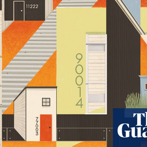
Even if you think you’ve never seen it before, if you step outside, you might very well see this typeface going up on homes in your neighborhood. And it could be a sign that rents are going up.

Neutraface – a typeface known for its clean lines and its legibility from a distance – has been dubbed the unofficial font of gentrification, according to eagle-eyed Twitter and Instagram users who have spotted the typeface (and others like it) on buildings around the country.

Vice writer Bettina Makalintal documented the rise of Neutraface and similar fonts in 2020, after a tweet showing an image of black numbers in the style went viral. “Times New Craft Brewery,” one user quipped. Since then sightings have not abated, and interpretations of the style have proliferated.

Show Less
Recommend
Post
Save
Complete
Collect
Mentions
See All
Dennis Duncan @djbduncan · May 17, 2023
  • Post
  • From Twitter
Uh oh. Good article on the Neutraface font - or “Times New Craft Brewery” - as a harbinger of gentrification. (Features the always-astute @TypeTasting)
  • upcarta ©2025
  • Home
  • About
  • Terms
  • Privacy
  • Cookies
  • @upcarta