Thread
Pricing is 1% Math.
And 99% Psychology.
Here are 15 Pricing Psychology principles to get your user spending:
And 99% Psychology.
Here are 15 Pricing Psychology principles to get your user spending:
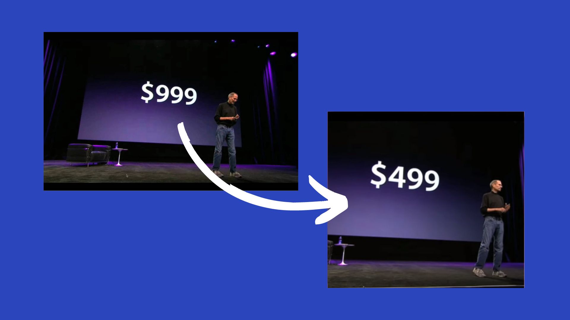
Set The Bar High
Users hang on to that initial piece of information. It affects all judgments.
And it works even if the number isn't related to the decision at hand.
So start with the highest price or just a high number - both work.
Users hang on to that initial piece of information. It affects all judgments.
And it works even if the number isn't related to the decision at hand.
So start with the highest price or just a high number - both work.
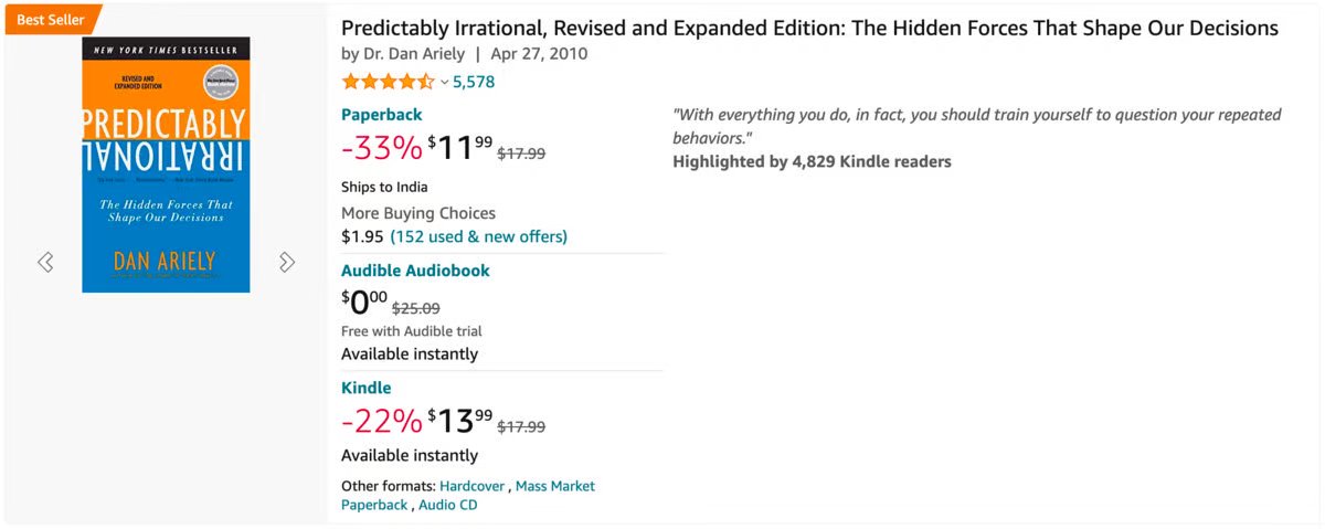
Spotlight The Savings
People hate spending.
But they love saving money even more
Put the emphasis on the savings, and you'll get them smiling (and spending).
People hate spending.
But they love saving money even more
Put the emphasis on the savings, and you'll get them smiling (and spending).
No More Commas
When, I, Put, These, Commas
The sentence seems longer...
It's the same with numbers.
For humans: 1,500,000 > 1.5M
When, I, Put, These, Commas
The sentence seems longer...
It's the same with numbers.
For humans: 1,500,000 > 1.5M
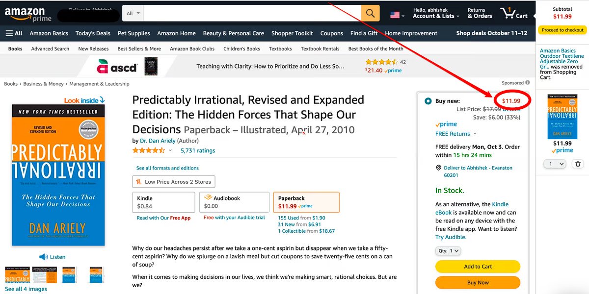
Reduce Price Fonts
The bigger the font,
The bigger the impact.
So when you're selling an individual product, keep that font size small.
The bigger the font,
The bigger the impact.
So when you're selling an individual product, keep that font size small.
Increase The Font Of Discounts
Using that same logic, when you want to make the discounts feel larger...
Increase the price fonts.
Bigger font = Bigger discount
That's at least how we think.
Using that same logic, when you want to make the discounts feel larger...
Increase the price fonts.
Bigger font = Bigger discount
That's at least how we think.
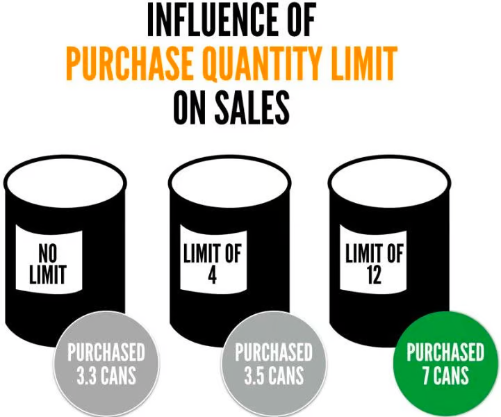
Set A High Quantity Limit
When Campbell's soup moved its purchase limit from 0 to 12...
The average number of purchased cans went from 3.3 to 7.
That's a 112% increase in sales!
When Campbell's soup moved its purchase limit from 0 to 12...
The average number of purchased cans went from 3.3 to 7.
That's a 112% increase in sales!
Make Small Incremental Changes
Jump too much, and you'll lose them
Jump enough, and you'll make $$$
Want to learn how to do this right? I'm breaking it down in my newsletter this Thursday. Join 18,000+ others for $0: psychologyofmarketing.beehiiv.com/subscribe?utm_source=twitter&utm_medium=social&utm_campaign=mid_thr...
Jump too much, and you'll lose them
Jump enough, and you'll make $$$
Want to learn how to do this right? I'm breaking it down in my newsletter this Thursday. Join 18,000+ others for $0: psychologyofmarketing.beehiiv.com/subscribe?utm_source=twitter&utm_medium=social&utm_campaign=mid_thr...
Start With The Bad News
When you do that:
1/ you grab attention
2/ you make an offer that looks fair
That way, people are more likely to buy
When you do that:
1/ you grab attention
2/ you make an offer that looks fair
That way, people are more likely to buy
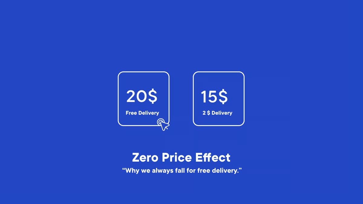
Insert The Element of "Free"
Nothing sells like the word Free!
For instance, a $20 product with free delivery will sell more than a $15 product with a $2 delivery fee
It's definitely not math. It's psychology
Nothing sells like the word Free!
For instance, a $20 product with free delivery will sell more than a $15 product with a $2 delivery fee
It's definitely not math. It's psychology
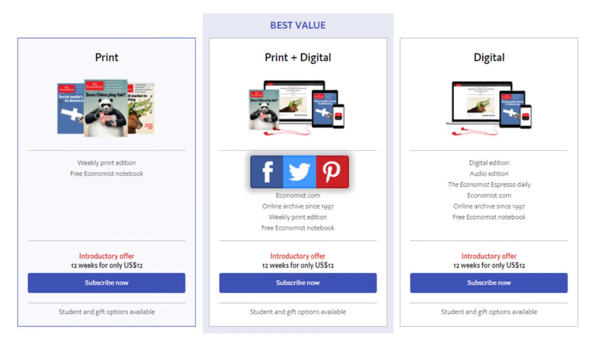
Keep It Center Stage
We tend to be drawn to the option that's placed right in the middle.
It's perceived as the most popular option. So put your target offer there.
We tend to be drawn to the option that's placed right in the middle.
It's perceived as the most popular option. So put your target offer there.
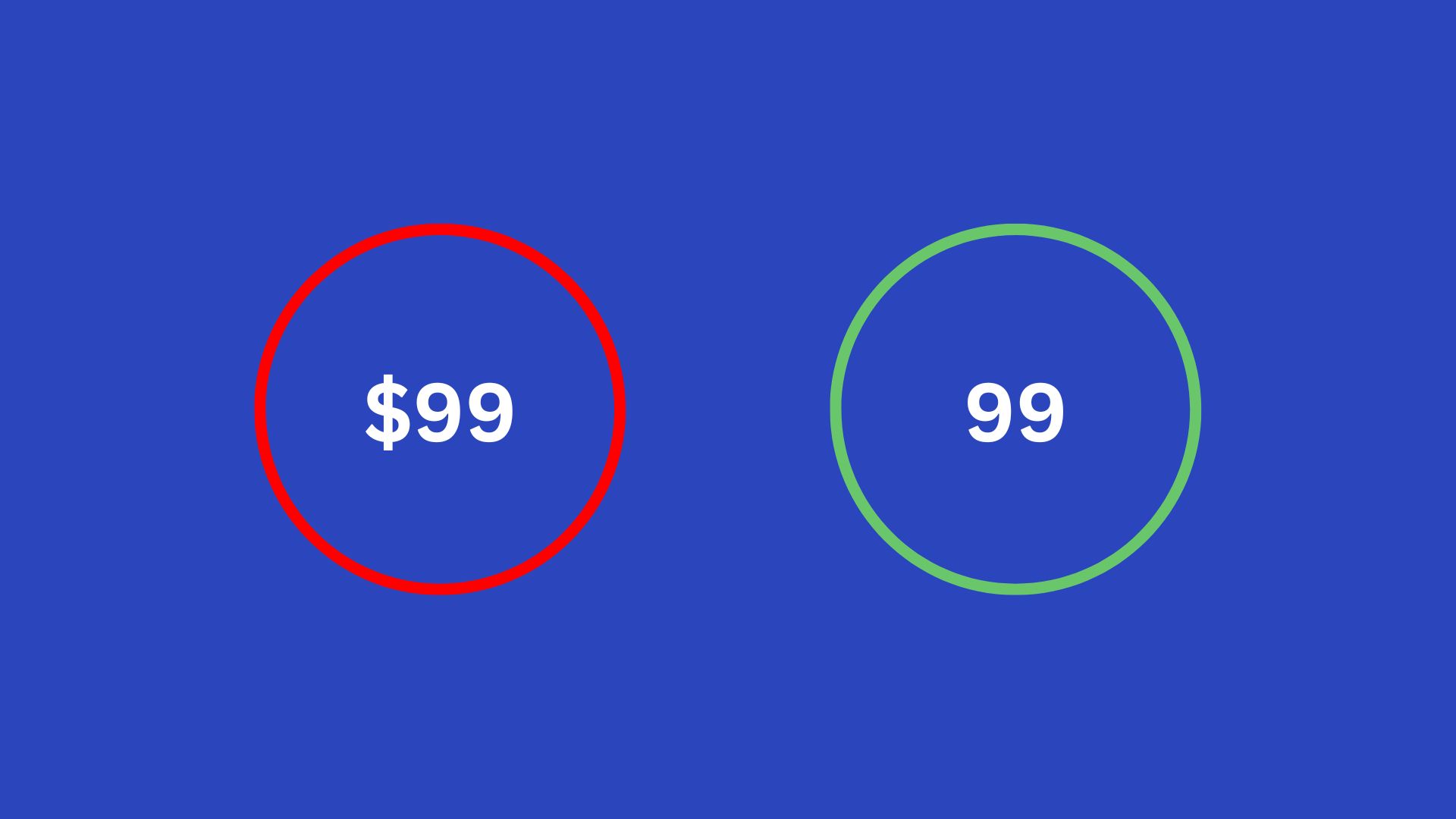
Remove The Currency Symbol
Simply looking at this $ symbol hurts
So when possible, remove it.
It'll reduce the pain of paying and trust me, that's high enough already!
Simply looking at this $ symbol hurts
So when possible, remove it.
It'll reduce the pain of paying and trust me, that's high enough already!
Odd-Even Pricing
Want your offer to be perceived as a luxury, stick to prices ending in 0 or 5
Want it to look like a good deal, stick to prices that end with 7, 8, or 9.
Want your offer to be perceived as a luxury, stick to prices ending in 0 or 5
Want it to look like a good deal, stick to prices that end with 7, 8, or 9.
Break Down Your Offer
To the lowest, reasonable unit of time
$100/day >> $3000/mo
It triggers comparisons that make your offer too good to pass on.
To the lowest, reasonable unit of time
$100/day >> $3000/mo
It triggers comparisons that make your offer too good to pass on.
Pay Now, Buy Later
We all know paying hurts.
But it hurts lesser when we pay before we consume. That way, we got something to look forward to.
So charge on the first day of the subscription, not the last...
We all know paying hurts.
But it hurts lesser when we pay before we consume. That way, we got something to look forward to.
So charge on the first day of the subscription, not the last...
That's all for me!
Any more numbers and my head is gonna burst. So let's not do that...
Still, if you can think of any other tactics or questions, I'd love to see them in the comments :)
Any more numbers and my head is gonna burst. So let's not do that...
Still, if you can think of any other tactics or questions, I'd love to see them in the comments :)
And now for the last pricing psychology tactic, check out my free newsletter - Psychology of Marketing:
I teardown 1 psychological principle
Share 3 actionable tactics
All in under 5 minutes - guaranteed.
Join 18,500+ marketers for $0 here: psychologyofmarketing.beehiiv.com/subscribe?utm_source=twitter&utm_medium=social&utm_campaign=threads...
I teardown 1 psychological principle
Share 3 actionable tactics
All in under 5 minutes - guaranteed.
Join 18,500+ marketers for $0 here: psychologyofmarketing.beehiiv.com/subscribe?utm_source=twitter&utm_medium=social&utm_campaign=threads...
tl;dr
14 Pricing Psychology Principles
1. Set The Bar High
2. Odd-Even Pricing
3. No More Commas
4. Pay Now, Buy Later
5. Reduce Price Fonts
6. Keep It Center Stage
7. Spotlight The Savings
14 Pricing Psychology Principles
1. Set The Bar High
2. Odd-Even Pricing
3. No More Commas
4. Pay Now, Buy Later
5. Reduce Price Fonts
6. Keep It Center Stage
7. Spotlight The Savings
8. Break Down Your Offer
9. Start With The Bad News
10. Set A High Quantity Limit
11. Insert The Element of "Free"
12. Remove The Currency Symbol
13. Increase The Font Of Discounts
14. Make Small Incremental Changes
9. Start With The Bad News
10. Set A High Quantity Limit
11. Insert The Element of "Free"
12. Remove The Currency Symbol
13. Increase The Font Of Discounts
14. Make Small Incremental Changes
