Thread by Alex Garcia
- Tweet
- Dec 31, 2022
- #Sales #DecisionMaking
Thread
One simple psychology tip to help you increase sales:
Dan Ariely gave a presentation that broke down the psychology behind The Economist’s pricing structure.
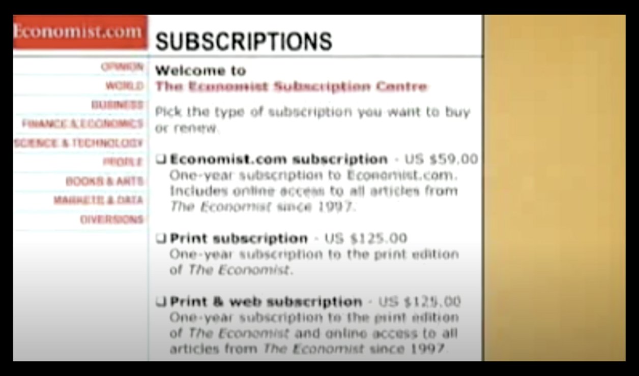
The Economist used to have three price points.
Online: $59
Print-Only: $125
Print & Web: $125
Looking at it, the print-only option looks pointless.
But, it’s not...
The Economist used to have three price points.
Online: $59
Print-Only: $125
Print & Web: $125
Looking at it, the print-only option looks pointless.
But, it’s not...
Dan Ariely led a study where he gathered 100 MIT students and presented them with two different pricing options.
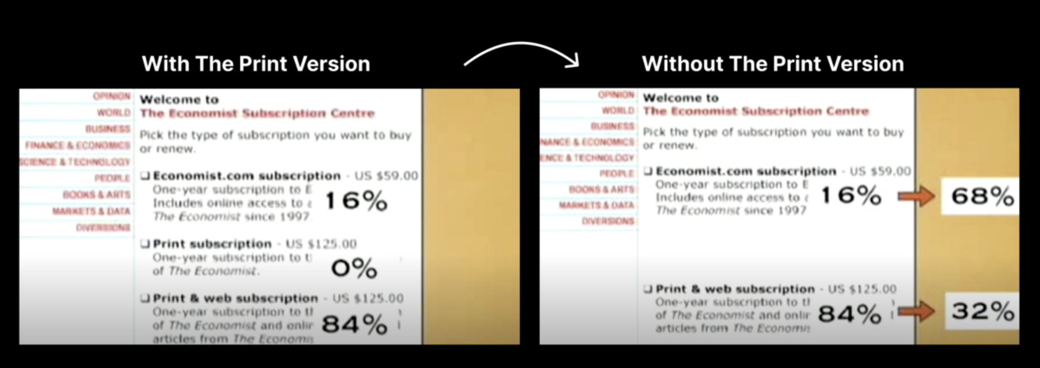
He presented the first 100 students with the current pricing structure:
He presented the first 100 students with the current pricing structure:
• 16% said they’d purchase the online only option
• 0% said they’d purchase the print only option
• 84% said they’d purchase the online and print option
But, when Dan Ariely eliminated the middle option and presented it to another 100 students - the results changed:
• 0% said they’d purchase the print only option
• 84% said they’d purchase the online and print option
But, when Dan Ariely eliminated the middle option and presented it to another 100 students - the results changed:
So, what was the most popular option became the least desired option.
Now:
• 68% wanted the online only option
• 32% wanted the print & online option
So, what seemed useless was useful in helping consumers determine what they wanted.
Why?
Now:
• 68% wanted the online only option
• 32% wanted the print & online option
So, what seemed useless was useful in helping consumers determine what they wanted.
Why?
Because the middle option served as a decoy to make the premium purchase look like an unbeatable deal.
This is called The Decoy Effect.
But here’s how to make it even better...
This is called The Decoy Effect.
But here’s how to make it even better...
Sorry, quick note.
This is a case study from my newsletter Marketing Examined.
If you enjoyed it, then you should join 45k+ of us that get:
• Two case studies a week
• All action no fluff
Only goal is for you to become a better marketer:
www.marketingexamined.com/subscribe
Onward...
This is a case study from my newsletter Marketing Examined.
If you enjoyed it, then you should join 45k+ of us that get:
• Two case studies a week
• All action no fluff
Only goal is for you to become a better marketer:
www.marketingexamined.com/subscribe
Onward...
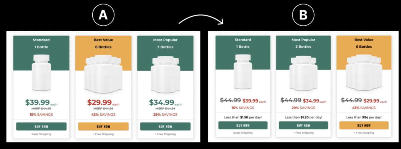
. @dtcpages asked a great question on Twitter, “Can you guess the winning test variant?”
And one of the variants is more than $20k per month more valuable than the other.
Here are the options:
And one of the variants is more than $20k per month more valuable than the other.
Here are the options:
The correct answer is B.
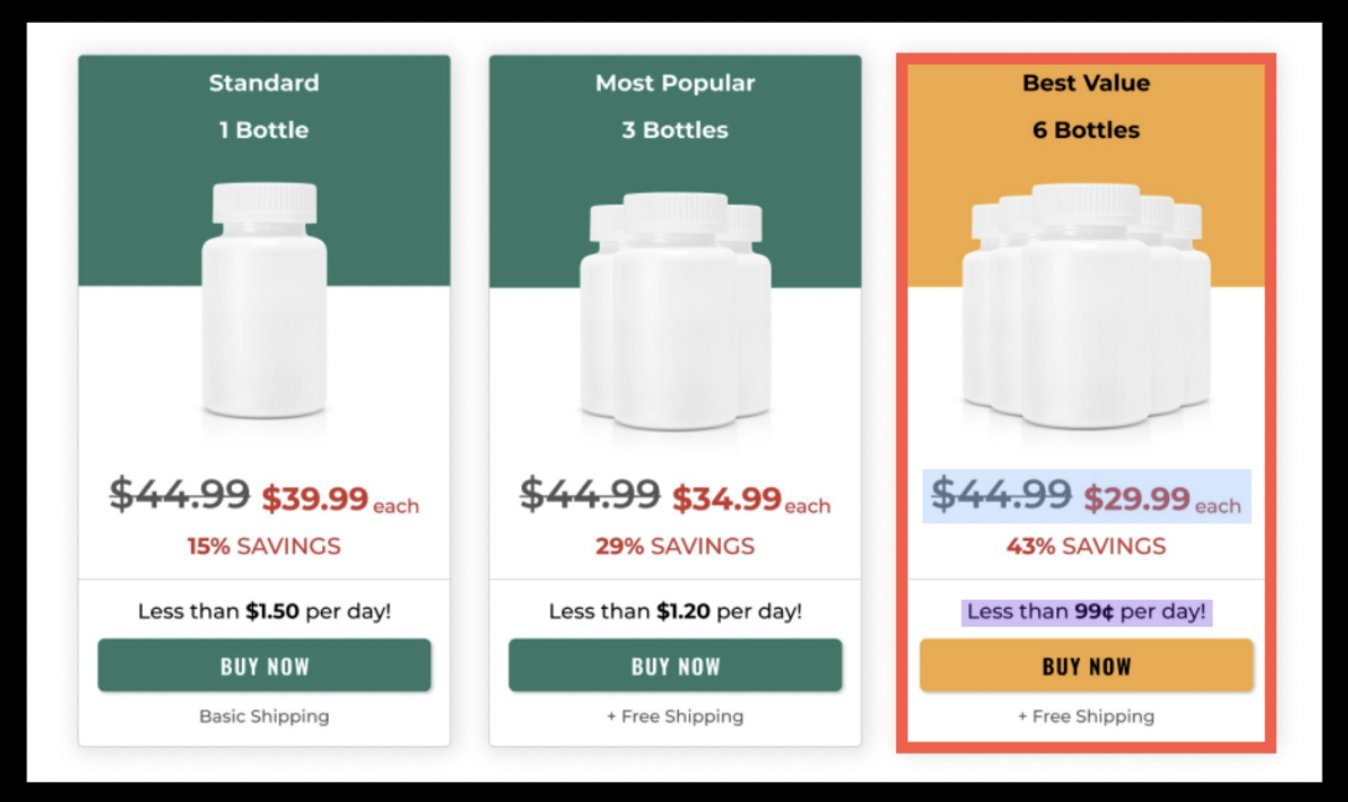
Here’s why:
• Shifting the best value offer to the right while using an eye-catching color
• Displaying the comparison price larger than the discounted price
• Displaying the price per day minimizes the mental cost
Here’s why:
• Shifting the best value offer to the right while using an eye-catching color
• Displaying the comparison price larger than the discounted price
• Displaying the price per day minimizes the mental cost
So, putting it all together:
• Use the decoy effect to help consumers determine what they want
• Add a middle option that makes the premium purchase seem like a great deal
• Use a different color to make the premium purchase eye-catching
(Continued)
• Use the decoy effect to help consumers determine what they want
• Add a middle option that makes the premium purchase seem like a great deal
• Use a different color to make the premium purchase eye-catching
(Continued)
• Make the comparison price or original price much larger than the discounted cost
• Minimize the mental costs by adding a price per day that shrinks the cost with logic
• Minimize the mental costs by adding a price per day that shrinks the cost with logic
Plus, if you want to follow me @alexgarcia_atx then expect a galore of growth marketing content on your feed.
I spend all my time researching, writing, and distilling it here so you can learn as you scroll.
Content to come:
• landing pages
• content marketing
• copywriting
I spend all my time researching, writing, and distilling it here so you can learn as you scroll.
Content to come:
• landing pages
• content marketing
• copywriting
Here's the full video from Dan Ariely where he breaks down the test:
Another note: follow @danariely. I’ve learned a ton from him.
And he has a great website with a ton of content worth diving into:
danariely.com
And he has a great website with a ton of content worth diving into:
danariely.com


