Thread by The Cultural Tutor
- Tweet
- Feb 6, 2023
- #Computersecurity
Thread
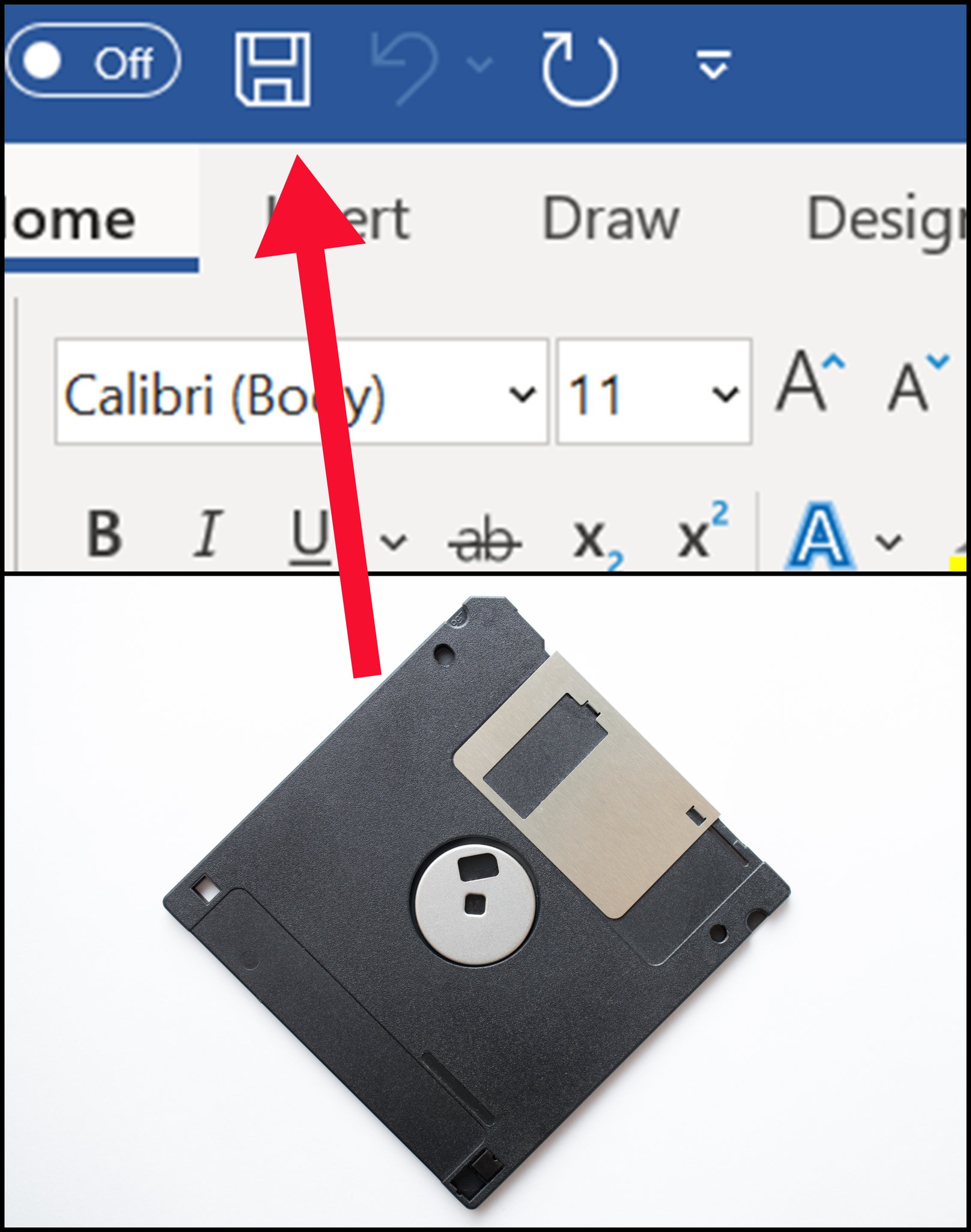
Have you ever noticed that the save icon is a floppy disk, even though they became obsolete twenty years ago?
That's called a "skeuomorph" - when something new takes on the appearance of what it replaced.
And once you start to look, they're everywhere...
That's called a "skeuomorph" - when something new takes on the appearance of what it replaced.
And once you start to look, they're everywhere...
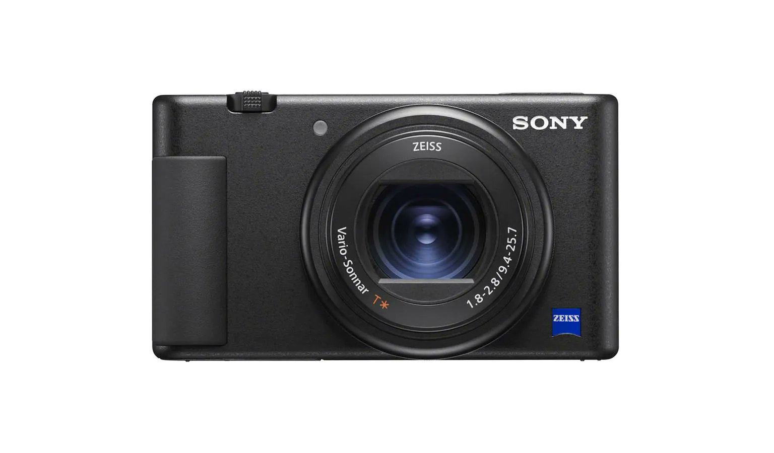
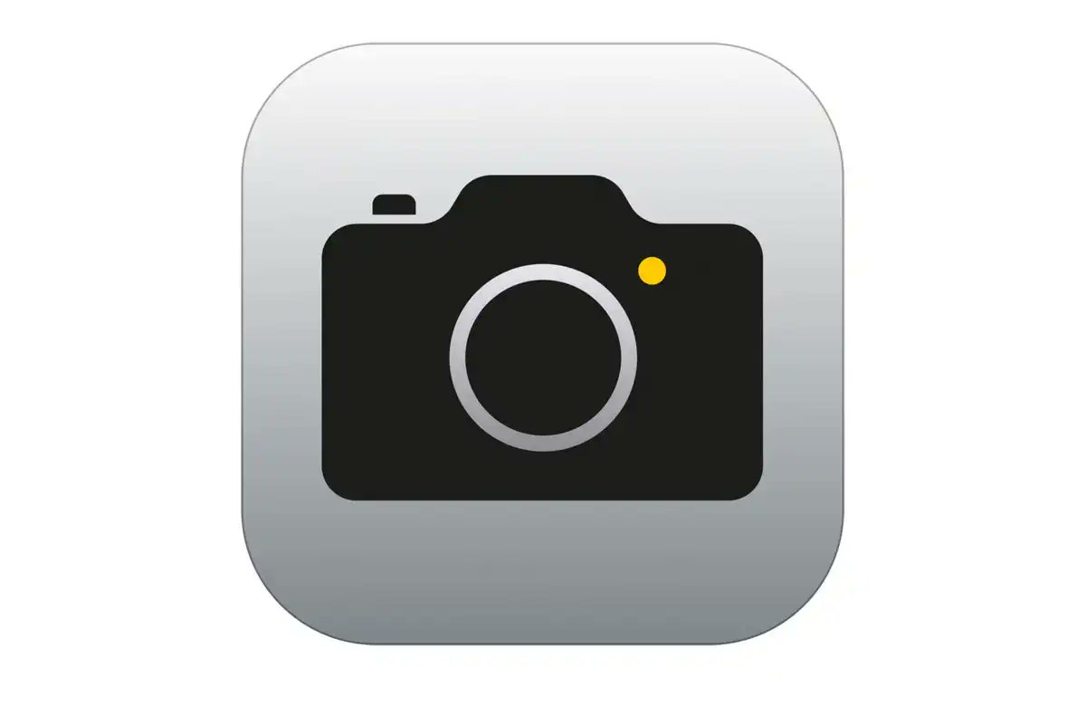
Another example is phone cameras. Even though they don't have mechanical shutters, they make a clicking sound like physical cameras do.
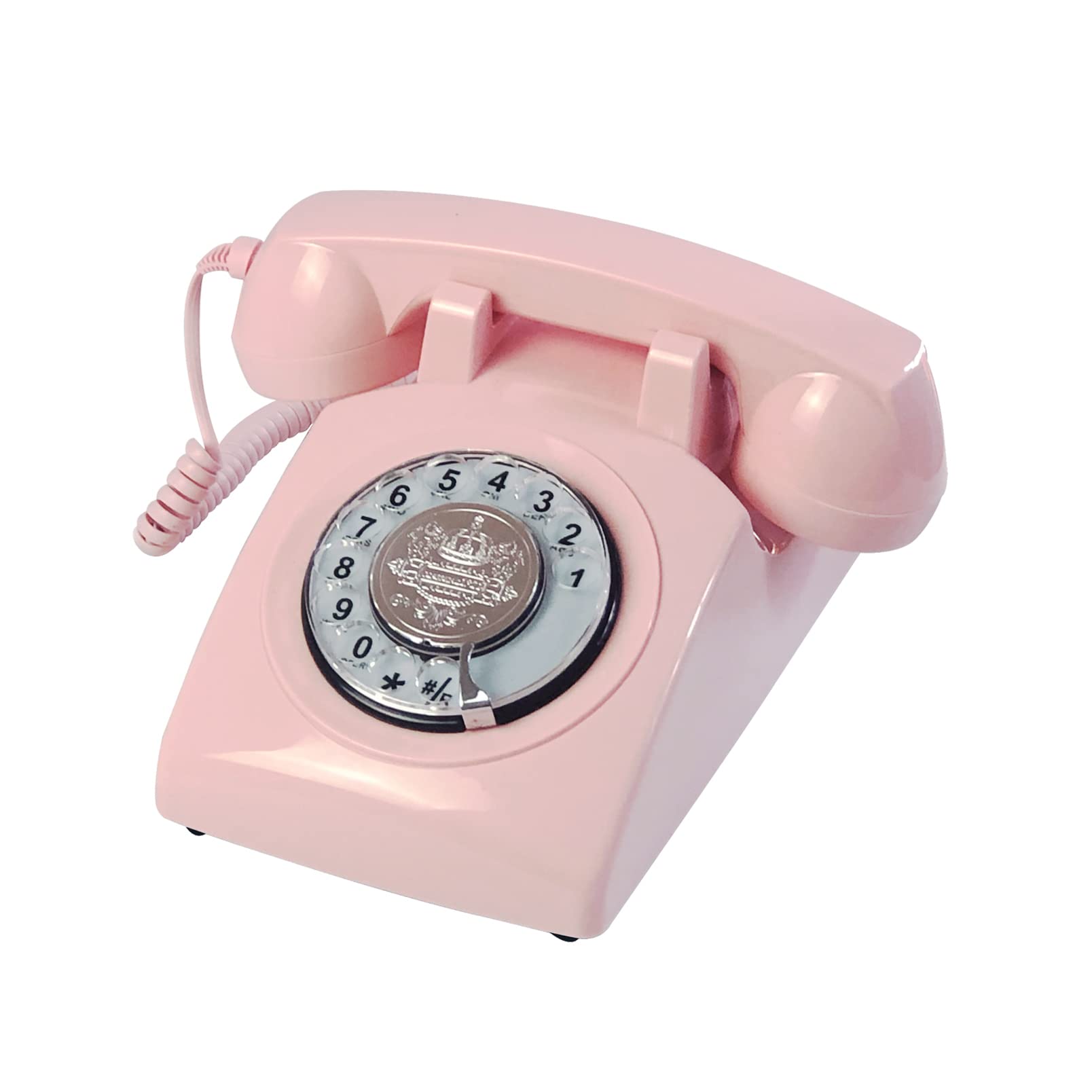
And the phone icon itself looks like an old corded telephone:
And the phone icon itself looks like an old corded telephone:
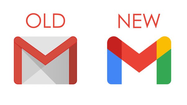
Or the various logos for email providers, like that of Gmail, which imitates the appearance of an envelope despite there being no paper or postage involved:
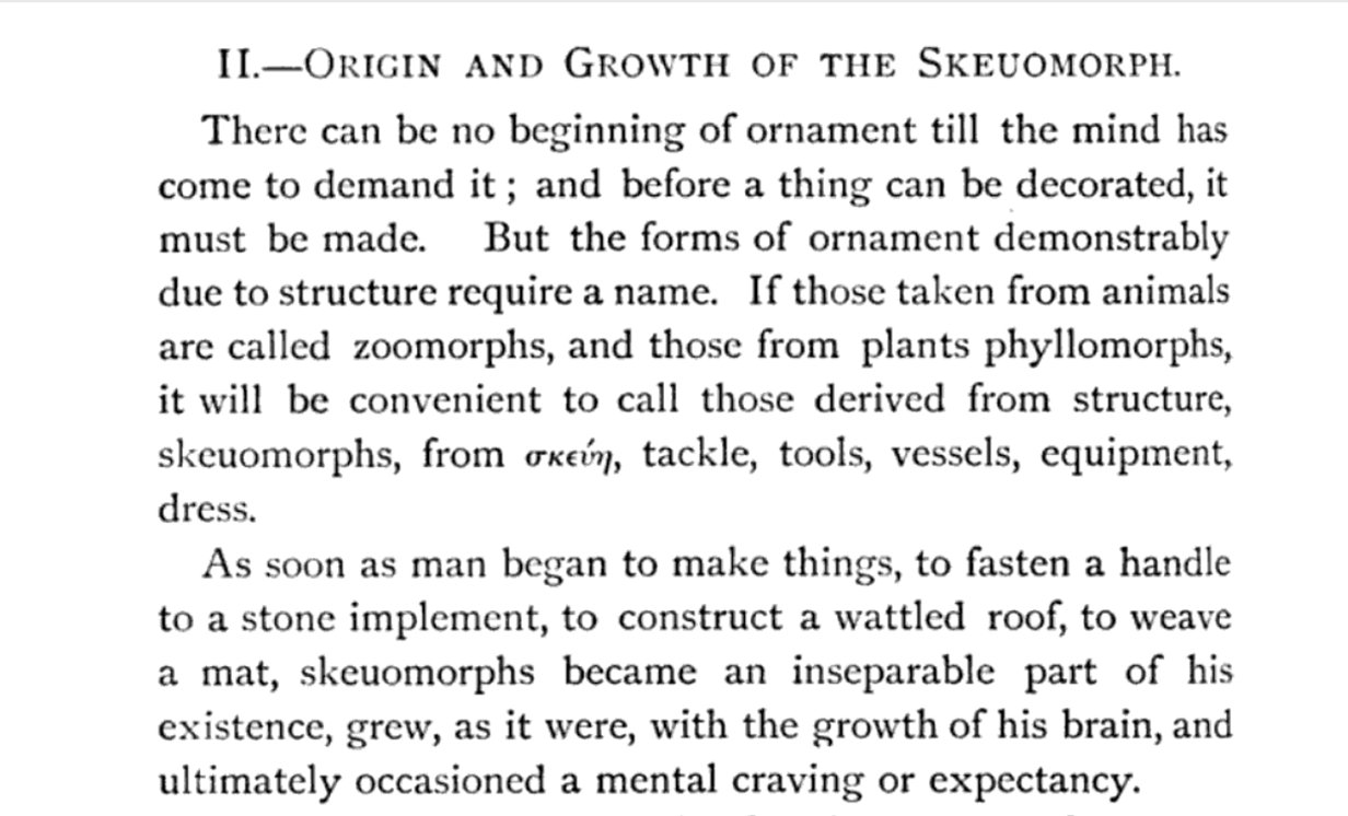
The word skeuomorph was coined by the archaeologist H. Colley March in 1889, when he noticed that some ancient artefacts retained the design features of older objects, even when they were no longer necessary.
Here is how he described it; expectancy might be the key word.
Here is how he described it; expectancy might be the key word.
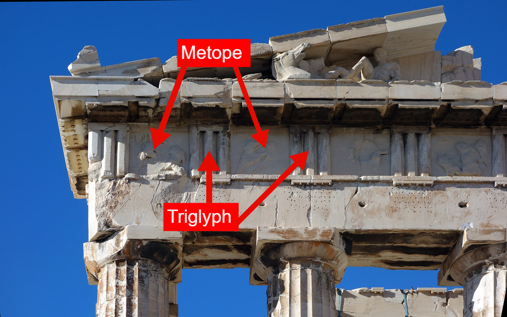
Perhaps the best ancient example is classical architecture itself.
Greek temples were once made out of wood, but even when built from stone the masons continued to adopt the forms of the old buildings.
Triglyphs represent the ends of wooden beams.
Greek temples were once made out of wood, but even when built from stone the masons continued to adopt the forms of the old buildings.
Triglyphs represent the ends of wooden beams.
And there are plenty more recent examples.
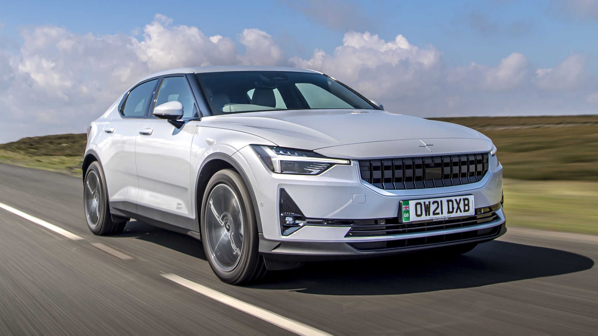
Cooling vents are needed for cars with combustion engines, but not for electric cars.
Yet a car without a grill can look odd, so many designers have retained them for electric cars, despite being functionally unnecessary.
Cooling vents are needed for cars with combustion engines, but not for electric cars.
Yet a car without a grill can look odd, so many designers have retained them for electric cars, despite being functionally unnecessary.
What's the point of a skeuomorph?
Well, even though some are purely aesthetic, others can be incredibly useful.
An aesthetic example might be hubcaps. Though they do offer protection from rust, their decorative appearance evokes the spokes of old wheels.
Well, even though some are purely aesthetic, others can be incredibly useful.
An aesthetic example might be hubcaps. Though they do offer protection from rust, their decorative appearance evokes the spokes of old wheels.
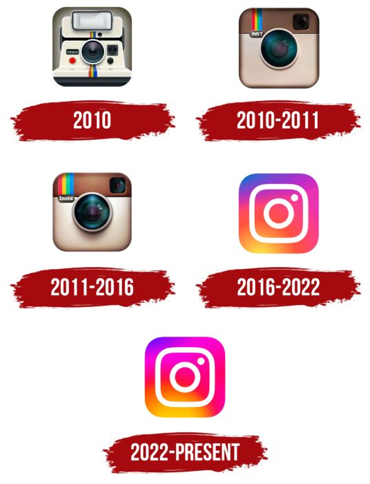
Or, say, the Instagram logo.
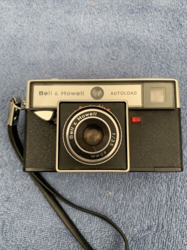
Over the years it has been gradually simplified, but still directly recalls the appearance of an old-fashioned film camera.
Over the years it has been gradually simplified, but still directly recalls the appearance of an old-fashioned film camera.
And so with the rise of the digital age skeuomorphs have become a central - and controversial - element of design.
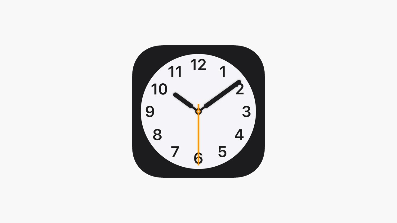
Using a floppy disk to symbolise saving is only one example - there's also the desktop recycle bin and clock icon, two physical objects with digitised appearances.
Using a floppy disk to symbolise saving is only one example - there's also the desktop recycle bin and clock icon, two physical objects with digitised appearances.
And what about the Kindle, which is full of skeuomorphic features inherited directly from books?
As H. Colley March said back in 1889, it seems to be about expectancy. We are used to books being a certain way and that's how we want them to look.
As H. Colley March said back in 1889, it seems to be about expectancy. We are used to books being a certain way and that's how we want them to look.
Many skeuomorphs were originally about making new technology familiar and easy to understand.
There's no need for the camera icon to *look* like an old-fashioned, physical camera. But when it does look that way, we intuitively understand what it is.
There's no need for the camera icon to *look* like an old-fashioned, physical camera. But when it does look that way, we intuitively understand what it is.
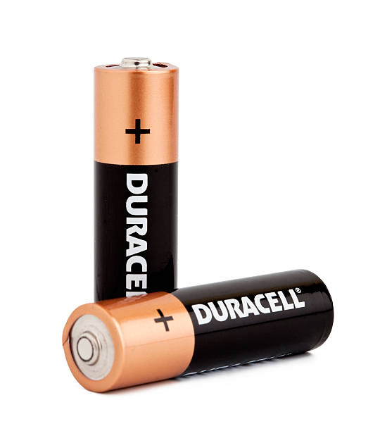
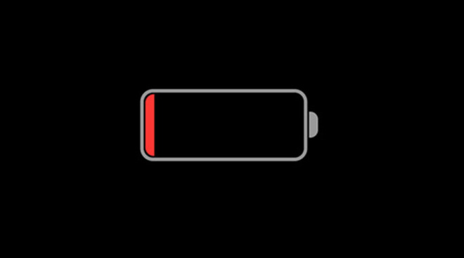
Or the battery icon on phones, which could just be a number - or any other comprehensible symbol, for that matter - but instead imitates physical batteries.
Not functionally required, but encouraged by familiarity and expectancy - we understand without needing to be told.
Not functionally required, but encouraged by familiarity and expectancy - we understand without needing to be told.
In all of these examples digital things are being given the illusion of physicality; they are represented as things they are not.
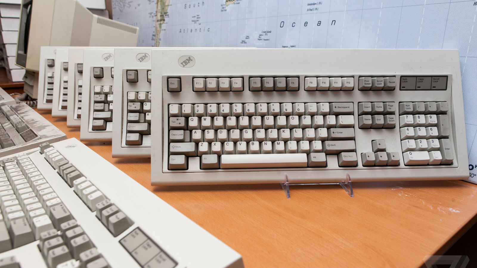
There's no reason why digital keyboards need to make sounds, but in so doing they take on the characteristics of physical keyboards.
There's no reason why digital keyboards need to make sounds, but in so doing they take on the characteristics of physical keyboards.
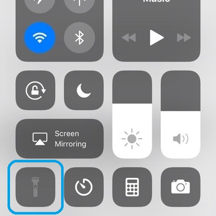
There's no reason why digital notes need to look like bound paper, or the flashlight icon like a real flashlight, the lock screen like a real padlock, and so on and so forth.
Perhaps it does work, but with such reference to the past there also comes a great deal of restriction.
Perhaps it does work, but with such reference to the past there also comes a great deal of restriction.
And so the recent trend has been to move away from skeuomorphism and toward more minimalist, simplified, purely digital design.
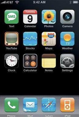
The older iPhone operating systems were rather more skeuomorphic than they are now.
The older iPhone operating systems were rather more skeuomorphic than they are now.
And the aforementioned Instagram logo has, similarly, changed from something wholly literal to a cleaner, simpler design.
The list of recent design declutters, of course, could go on and on.
The list of recent design declutters, of course, could go on and on.
Most interesting is that many people have never even used the objects imitated by these skeuomorphs.
Corded telephones, floppy disks, film cameras, even envelopes - these are things from the past shaping the appearance of the present and the future.
Corded telephones, floppy disks, film cameras, even envelopes - these are things from the past shaping the appearance of the present and the future.
And so skeuomorphs divide opinion.
Are they an effective model and a natural progression from the physical to the digital?
Or should digital design be unshackled from past expectations and more free to innovate?
Are they an effective model and a natural progression from the physical to the digital?
Or should digital design be unshackled from past expectations and more free to innovate?
Mentions
See All
Ben Hunt @EpsilonTheory
·
Feb 7, 2023
Fantastic thread!
